In a world that is constantly changing, keeping pace with the latest technology is becoming ever more important. Customers are also in turn demanding more as the age of ecommerce has made many items available with the snap of a finger. Now more than ever, the need for consistent transparency has become imperative in order to thrive in the modern business environment.
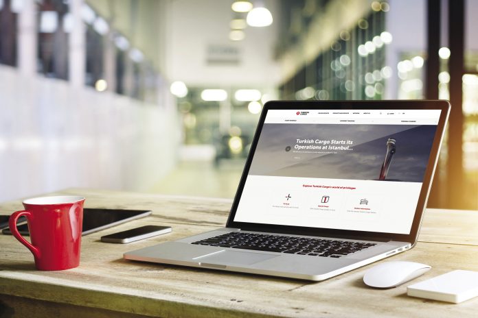
To that end, one of the world’s fastest-growing cargo airlines, Turkish Cargo, recently updated their corporate website to be accessible from all around the world. The new interface was designed to be even more accessible and includes many more functions compared to previous versions. Users can now easily find out a variety of information about the world of Turkish Cargo.
The simple and elegant design of the upgraded website allows users with the ability to reach any kind of up-to-date information about the products, contents and services provided by the carrier. With services in over 124 countries around the world, Turkish Cargo is enabling all their customers with the ability to easy view standard frequently-used processes such as flight schedules, cargo tracking, terminal charges, flight network, fleet and station details inquiry.
The new website upgrade is just one part of the air cargo carrier’s strategy towards digitalization as it aims to be one of the top-five global air cargo brands by 2023. Join us as we explore the brand-new system that Turkish Cargo has put in place.
A Bright New Beginning
The homepage of any website is very important. It’s often the first place anyone visiting will go. If the page is poorly designed, the chances of a user leaving are extremely high. That’s why it’s so important to leave a good first impression. This is exactly what Turkish Cargo has done, with a clearly easy to read and navigate page. One of the first noticeable items are the drop-down boxes up top highlighting a few of the most frequently used parts of their website. Customers will often visit requesting information about flight schedules, shipment tracking, and information about terminal charges.

As you can see, these are very easily visible and accessible, above the fold, and immediately available for customers to utilize.
Clicking on the shipment tracking, for example, opens up an easy to navigate dialog box requesting the AWB number. Once inputted correctly, users are given an easy to read update on exactly where their cargo is at along the transportation process. This is exactly the type of informative, easy to use, and transparent practices that busy customers crave.


Just below the fold is an area that holds more valuable information for the user. The privileges that Turkish Cargo offer are on display as users are easily able to navigate and explore the variety of options available. Just below that is a clearly visible section devoted to news and announcements that anyone interested in can read and enjoy.
Landing Pages

A smart new approach that Turkish Cargo has taken is making landing pages specific to each individual interest a customer may have. For example, a customer may have an inquiry related to special cargo and the services that Turkish Cargo can offer. By either going through the navigation at the top of the page, or through a search engine, that user is directed to exactly what they are looking for.
Digging down a little bit further reveals a range of special services that Turkish Cargo offers. Again, by either navigating or utilizing a search engine brings users to exactly what they are looking for. Utilizing this strategy and approach to website design and function is enabling Turkish Cargo to better market and cater to specific customer needs, and in the end saves users of the website time and frustration by not be able to find exactly what they are looking for.

Accessible Anywhere

A large percentage of users will continue to access the information that Turkish Cargo provides through their desktop computers, but arguably one of the biggest upgrades for the new website was the responsive design built right into the system. This allows users to access the same information wherever they may be and on any device. Phones, tablets, laptops, desktops; it’s all readily accessible and able to easily navigate through the new website.
A New Home
Through achieving sustainable growth with newly-launched destinations, current infrastructure and investments, Turkish Cargo keeps enhancing their capacity in more than 300 destinations included in their current flight network.
As such, the new website is one piece of the puzzle as Turkish Cargo has more exciting announcement on the horizon. One of the biggest is the imminent opening of the new Istanbul Airport which Turkish Cargo will soon call home. With this new space comes new opportunities for the carrier as they look to become one of the top-five global air cargo brands by 2023. Turkish Cargo has already laid the foundation for success with a new digital home. This sharp new presence online will soon be reflected similarly in the real world and combined together the future for the carrier is certainly looking bright.
อัพเดตข่าวสารและบทความที่น่าสนใจในอุตสาหกรรมโลจิสติกส์ก่อนใคร ผ่าน Line Official Account @Airfreight Logistics เพียงเพิ่มเราเป็นเพื่อน @Airfreight Logistics หรือคลิกที่นี่


